Design Systems
Backoffice CMS redesign: adapting a design system to resolve usability issues
Overview
When the sports product was migrated to a new front-end tech stack, the backoffice Content Management System (CMS) was created with no input from design. The existing system functioned primarily as a raw database view, forcing users to administer content through generic drop-down menus and unified lists. This needed to change.
The problem
Database-Driven Interface: The legacy tool surfaced raw database records directly to users. Administering diverse content types – such as banners, carousels, links, and promoted items – required selecting types from a single drop-down menu, resulting in cluttered lists and poor usability.
Unnecessary Complexity: Global fields were on display at all times across all systems, none were marked as mandatory, and there was no explanation as to what was required, with little feedback when something went wrong.
The solution
I led the UX redesign of the CMS to align with the new front-end tech stack. Current AI tools to accelerate build cycles were not available, so rather than building from scratch, I took an existing design system and rebuilt its core components in Figma. This foundation allowed us to adapt and add custom UI elements specifically needed for complex content management.

the 3rd-party component library
The approach

screen describing management of content carousels
User & Product Research: We conducted research into the current CMS platform and gathered direct feedback from product management and internal users to identify primary workflow pain points.
Component Library Rebuild: Although Figma files for the third-party design system were available, the underlying component library was hidden. Working closely with product and development teams, I rebuilt the missing base components in Figma. This upfront investment allowed us to adapt the system to our exact needs and sped up overall design and delivery cycles.
Task-Focused Architecture: We separated the monolithic list interface into distinct management areas for banners, carousels, links, and promoted items. Scheduling controls were hidden by default and surfaced only where relevant.
Comprehensive Hand-off: We created detailed hand-off documentation, screen mockups, and component usage guides.
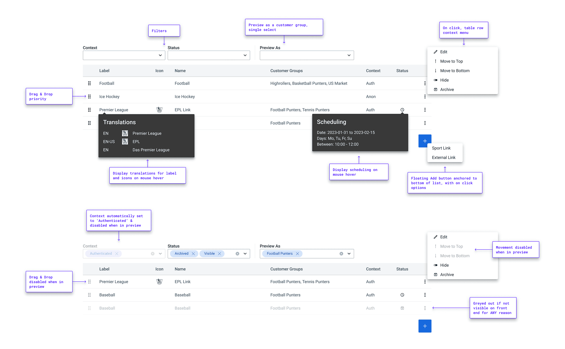

handoff screens showing management of the home multi menu
The impact
Accelerated Delivery: The initial outlay in rebuilding and extending the design system component library led to drastically reduced design iteration time and accelerated developer hand-off speed.
Streamlined Workflows: Separating content management areas, contextualising input fields, and providing feedback reduced UI clutter and input errors, allowing internal users to publish and update content quicker.
Improved Team Alignment: Opening direct lines of communication with development teams turned initial pushback into collaborative problem-solving.
Takeaways
Change Management Beyond UX: Following deployment, some users struggled because they had not received training on the new tool prior to launch. While training falls outside the direct scope of UX, I took the feedback on board and learned the importance of advocating for end-user onboarding plans during product rollouts.
Third-Party System Trade-Offs: Using an existing third-party design system seemed like an excellent choice until we discovered we lacked access to the underlying components. While it still significantly accelerated delivery, sourcing a fully accessible library would have been ideal – though none suitable were available at the time. This is a prime example of where modern AI tools can now bridge workflow gaps and speed up component reconstruction.