Product Design
Case Study: Tesco Lists & Favourites
Overview
Tesco 'Favourites' enables shoppers to view previous purchases and save items to lists. The experience is currently split into three views:
All: Every item purchased previously.
Usuals: A list of items bought regularly.
My List: A single user-generated/edited list.
The problem
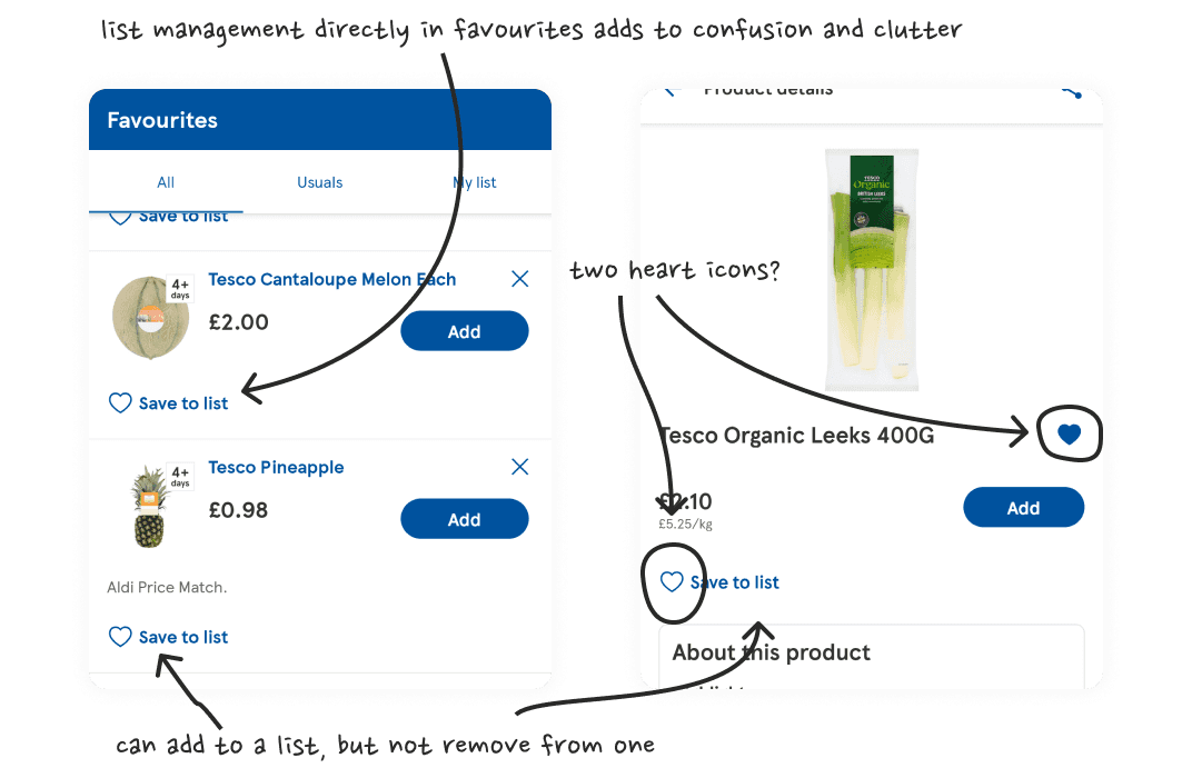
inconsistent states and dead-ends
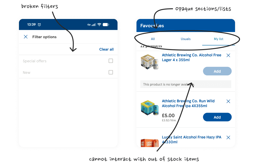
hidden algorithms and broken filters
Hidden algorithms: 'All' and 'Usuals' rely on unclear algorithms rather than explicit user preferences. Users cannot manually add items to these views, and there is no transparent logic behind when items appear.
Inconsistent states: The heart (favourite) icon acts as a filled indicator on product pages and lists but cannot be toggled off to remove items. 'Add to List' adds items to 'My List' from product pages and favourites, but similarly lacks a toggle-off mechanism.
List limitations: Users are restricted to a single custom list ('My List'). Out-of-stock items cannot be added to lists or inspected from list views.
Broken filtering & structure: Filtering on 'All' and 'Usuals' displays no usable options and is completely absent from 'My List'. Lists lack logical ordering or grouping.
The approach
Audited current user flows via app usage, screenshots, and competitor benchmarking.
Used an LLM (Gemini) to test edge cases and draft screen generation prompts.
Built a high-fidelity prototype using Stitch and Make, iteratively refining prompt inputs via the LLM to maintain Tesco’s design system constraints and efficiently resolve layout bugs and prototype flow issues.

working with Gemini
The solution
IA overhaul: Reconfigured 'Favourites' as an explicit user-curated view powered by a two-way heart toggle across product cards and pages. Replaced 'My List' with a multi-list management hub. Deferred 'Usuals'/'Regulars' to Phase 2, with a quick visual example included.
Improved list management: Standardised the two-way heart toggle for quick-favouriting, while routing custom list assignments through a bottom sheet modal on product detail pages only.
Enabled out-of-stock management: Enabled adding, viewing, and removing out-of-stock items from lists throughout the app.
Working filter & sort: Introduced bottom sheet overlays on the favourites view for filtering (e.g. category, offers, and dietary needs) and sorting (e.g. price and rating).

the finalised prototype
The impact
User agency: Shifted from opaque automated lists to explicit user curation.
Predictable UI: Standardised component states across product lists and detail views, eliminating dead-end visual states.
Scalable list building: Enabled multi-list creation via the modal sheet and list hub, unblocked out-of-stock item management, and improved filtering and sorting.
Takeaways
Hybrid prototyping strategy: Combining an LLM for prompt drafting, Stitch for rapid layout generation, and Make for targeted logic workflows proved to be the most cost- and time-efficient approach.
Knowing ‘good enough’: Iterative AI generation often introduces new bugs while fixing old ones. Understanding the target audience and session type (guided vs. unguided) prevents burning excess time and tokens on unnecessary polish.
Some notes
Prototype testing with target users would be the immediate next step.
To respect the existing design system, core brand tokens were locked against AI modification.
Visual/design inaccuracies introduced by Make/Stitch were intentionally left untouched, as demonstrating functional UX logic was the primary goal.
Framer AI was used to generate this page from a text document.
Post-Project App Update: Tesco recently added multiple custom lists to their live app. However, the feature is still somewhat clunky and misses most of the other issues raised here - heart icons still don't toggle off, out-of-stock items remain blocked, filters are still broken, and the confusing automated 'All' and 'Usuals' lists remain.